Standing in front of rows of colorful bolts, you might feel paralyzed by choice. Will the colors clash after washing? Are the prints too busy? What if you spend hours cutting only to realize something is off? These fears are common among quilters, but picking fabric for a quilt is a learnable skill built on a few clear principles.
This guide walks you through exactly how to pick fabric for a quilt, step by step. You will learn how to build a balanced color palette, mix print scales for visual depth, identify quality cotton, and test your selection before cutting. Whether you are making your first baby quilt or your fiftieth wall hanging, these strategies will help you choose fabrics with confidence.
Begin with Inspiration Before You Shop
The fastest way to feel overwhelmed is to start by browsing random fabrics. A better approach is to ground your choices in a clear purpose or mood before you ever visit a store.
Define the Theme or Mood First
Ask yourself what the quilt is actually for. A baby gift calls for soft pastels. A winter throw suggests warm tones and cozy textures. A modern wall hanging might lean toward bold geometrics and high contrast. Defining the purpose narrows your options instantly and prevents impulse purchases.
Pro Tip: Collect visual inspiration before shopping. Snap photos of sunsets, tile floors, or vintage postcards. Save Pinterest pins or sketch ideas in a fabric journal. These references become your color and texture roadmap.
Choose a Single Focus Fabric
One of the smartest shortcuts in fabric selection is starting with a focus fabric. This is one print that already contains every color you want in your quilt. It could be a floral, a scenic panel, or a bold geometric. Pull every other fabric from the exact tones found in that one print.
Example: If your focus fabric features navy, coral, mint, and cream, choose solids and prints that match those specific shades. This guarantees harmony, even when fabrics come from different collections.
Build a Color Palette That Works

Color is the heart of any quilt. You do not need to be a trained designer to get it right. You just need to apply a few tested principles that create depth and emotion.
Match Color Temperature
Keep your palette emotionally cohesive by sticking to one temperature family. Warm colors like reds, oranges, and golden browns feel cozy and inviting. Cool colors like blues, greens, and purples feel calm and serene. Mixing a warm brick red with a cool lavender often creates visual tension that feels “off.”
Do: Pair warm rust with golden yellow for a cozy autumn quilt.
Avoid: Combining warm browns with cool mint greens in the same palette.
Use Multiple Shades, Not One Flat Tone
Using the exact same shade of blue across every fabric creates a flat, matchy-matchy look. Instead, pull a range of values within each color family:
- Light turquoise
- Medium aqua
- Deep navy
This range creates depth and movement. The eye travels naturally through the quilt rather than getting stuck on one tone.
Add a “Zinger” Fabric for Energy
Every great quilt needs one fabric that surprises. This “zinger” could be a slightly off-tone color like mustard in a blue-green palette, a metallic thread, or a bold black-and-white stripe. It does not need to dominate the design. It simply adds spark and prevents the quilt from feeling predictable.
Mix Print Scales for Visual Depth
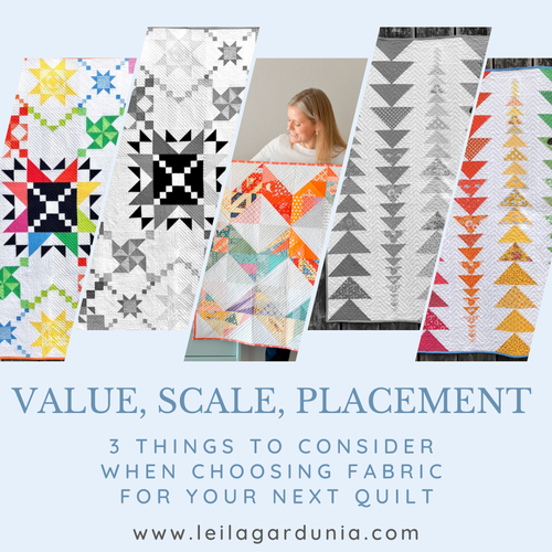
Scale refers to the size of the pattern repeat on a fabric. Mastering scale is what separates flat quilts from dynamic ones that pull you in.
Follow the Rule of Three Scales
A balanced quilt includes three different scale categories:
- Large-scale prints like big florals or bold motifs that serve as focal points
- Medium-scale prints like standard geometrics or moderate florals that offer variety
- Small-scale prints like tiny dots or micro designs that act as visual resting places
Using only large prints overwhelms the eye. Small prints give the viewer somewhere to rest and let the bold fabrics shine.
Use Blenders to Calm Busy Prints
Blenders are small-scale or tonal fabrics that read as “almost solid” from a distance. They separate loud prints, add texture without chaos, and help large motifs stand out. Examples include tone-on-tone dots, marbled textures, or subtle grids.
Pro Tip: If using a vibrant, busy print, surround it with two or three blenders. This lets the star fabric breathe and prevents visual clutter.
Vary Print Types and Textures
Even within one color family, mixing different print styles adds richness and personality to your quilt.
Combine Different Print Families
Include a mix of these styles for visual interest:
- Florals
- Geometrics such as dots, stripes, and checks
- Pictorials when working with a theme
- Solids or near-solids for breathing room
Example: Pair a floral with a small gingham and a solid linen-look cotton. The contrast in print styles keeps the eye engaged.
Add Texture for Visual Depth
Texture is not just tactile. It is also visual. Fabrics with different weaves or finishes catch light differently and add dimension. Try linen-cotton blends for a rustic feel, quilter’s voile for soft drape, or batiks for hand-dyed variation.
Caution: Avoid mixing heavy fabrics like flannel or denim with standard cotton unless you adjust your seam allowances and stitching techniques.
Choose Quality Quilter’s Cotton
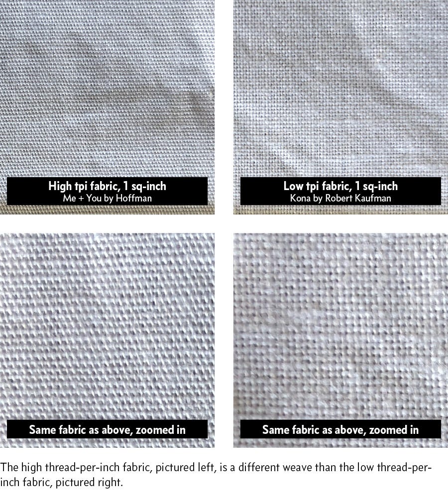
Not all cotton performs the same way. For quilts that last decades, quilter’s cotton is the gold standard.
Why Quilter’s Cotton Performs Best
Quilter’s cotton has specific characteristics that make it ideal:
- 100% cotton content
- Tightly woven 1×1 plain weave
- High thread count
- Colorfast and shrink-resistant dyes
This fabric cuts cleanly, sews smoothly, and holds its shape for years of use and washing.
Test: Hold fabric up to a light source. If you see many tiny holes, the weave is too loose for precision piecing.
Compare Quilt Shop vs. Retail Cotton
| Feature | Quilt Shop Cotton | Retail Chain Cotton |
|---|---|---|
| Weave | Tight and stable | Looser, may stretch |
| Color | Vibrant and consistent | Can fade or bleed |
| Price | $12+ per yard | $4 to $8 per yard |
| Best For | Heirloom quilts | Practice and utility quilts |
Bottom line: Use retail cotton for learning and practice pieces. Invest in quilt-shop quality for projects meant to become family heirlooms.
Avoid Bedding and Mixed Fibers
Bedding fabric is too tightly woven for standard machine needles, which causes skipped stitches and broken needles. Mixed fibers like polyester or stretch cotton shrink and wear at different rates. Never mix them in a washable quilt.
Exception: Art quilts or wall hangings that will not be laundered can use specialty fabrics like wool or silk.
Plan Your Fabric Pull Strategically
Now that you know what to look for, here is how to build your actual selection.
Use the 80/20 Rule for Balance
Build your fabric pull using this hybrid approach:
- 80% from one curated collection or designer line
- 20% from outside sources for binding, borders, or accent pieces
Curated collections from lines like Moda or Robert Kaufman are pre-coordinated. They already include varied scales and colors that work together. Adding 20% from elsewhere gives you harmony with a touch of surprise.
Try a Pre-Cut Bundle for Easy Coordination
Fat Quarter bundles, charm packs, and layer cakes from a single collection save time and ensure color coordination. They let you sample many prints without buying full yardage of each one. These bundles are perfect for scrappy quilts or when you are unsure how much fabric you will need.
Audit Your Selection Before Cutting

Do not cut your fabric until you have tested how the pieces work together. A simple audition process prevents costly mistakes.
Lay It Out on a Design Wall or Floor
Spread your fabrics on a flannel board, foam core, or clean floor. Arrange them by color family, value from light to dark, and scale. Seeing everything together reveals problems that are invisible when fabrics are stacked.
Take the Photo Test
Step back five or six feet and snap a photo with your phone. On screen, you will instantly spot clashing colors, missing contrast, or too many large prints competing for attention. Swap out anything that feels “off” before you cut.
Apply the Squint Test
Squint at your layout. Blenders and small prints should blur into a solid mass. Large prints should stand out clearly. If everything blends together, you lack contrast and need to add more value variation.
Buy the Right Amount of Fabric
Underbuying leads to heartbreak when a print gets discontinued mid-project.
Follow the 10% Rule
Buy at least 10% more fabric than your pattern specifies. This buffer covers cutting errors, fabric shrinkage if you pre-wash, and extra binding or border needs.
Calculate All Components
Include fabric for every part of the finished quilt:
- Quilt top
- Borders
- Binding
- Backing, which is usually 4 to 6 inches larger than the top on each side
Use online yardage calculators or charts based on your quilt size to estimate accurately.
Decide Whether to Pre-Wash
This is a personal choice, but consider these guidelines.
Pre-Wash If:
- Fabric is dark or red and may bleed
- You are mixing brands or unknown dye sources
- The finished quilt will be washed frequently
Skip Pre-Wash If:
- You are using high-quality quilter’s cotton designed to resist shrinkage
- You want crisp, starched fabric for precise cutting
Pro Tip: If you skip pre-washing, rinse a small swatch first to test for color bleeding before committing your full pieces.
Trust Your Instincts and Refine
After all the research and planning, listen to your gut. Does the fabric pull make your heart sing, or does it feel safe but boring? Swap one fabric for a bolder choice. Add a zinger if the design feels flat. If anxiety creeps in, name it and set it aside.
Great quilts are not made by perfection. They are made by intentional choices and the courage to enjoy the process.
Frequently Asked Questions About Picking Quilt Fabric
What is the best fabric for a beginner quilter?
Quilter’s cotton from a curated collection is the best choice for beginners. These fabrics are pre-coordinated, come in helpful pre-cut bundles, and have a tight weave that is easy to cut and sew accurately.
How many different fabrics should I use in a quilt?
Most quilts benefit from 6 to 12 different fabrics. This range allows enough variety for visual interest without becoming chaotic. Aim for a mix of large, medium, and small prints plus at least one blender.
Can I mix different fabric brands in one quilt?
Yes, you can mix brands as long as the fabrics are all 100% quilter’s cotton with similar weights. Pull colors from a focus fabric to ensure harmony across brands and collections.
How do I know if a fabric is high quality?
Hold the fabric up to a light source. High-quality quilter’s cotton has a tight weave with minimal light passing through. If you can see many tiny holes, the weave is too loose for precision piecing.
Should I pre-wash fabric before quilting?
Pre-wash dark or red fabrics to prevent bleeding. For high-quality quilter’s cotton in light colors, pre-washing is optional. Always test a small swatch first if you are unsure about colorfastness.
What is a focus fabric and why should I use one?
A focus fabric is a single print that contains all the colors you want in your quilt. Building your palette around this one fabric guarantees color harmony and simplifies every other decision in the selection process.
Key Takeaways for Picking the Right Quilt Fabric
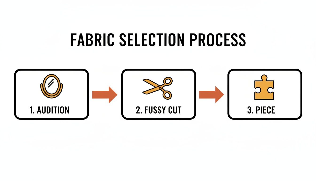
Picking fabric for a quilt becomes much easier when you follow a clear process. Start with inspiration, choose a focus fabric, and build a balanced palette using multiple shades within one color temperature. Mix print scales following the rule of three, and always include a zinger for energy.
Invest in quality quilter’s cotton for projects meant to last, and use the 80/20 rule to balance curated collections with personal accents. Before cutting, audition your selection using the photo test and squint test to catch problems early.
Your next step: Choose one project, gather 8 to 10 fabric candidates, and lay them out tonight. Apply the tests in this guide, then make your final cuts with confidence.