Standing in a fabric store surrounded by thousands of bolts can freeze even experienced quilters. The colors all look beautiful on their own, yet combining them into a finished quilt that feels balanced and intentional is a different challenge entirely. Many quilters fall back on favorite shades, only to discover the final piece looks muddy or chaotic once stitched together.
Knowing how to pick colors for a quilt means understanding how value, temperature, and harmony work together. This guide walks you through color theory fundamentals, tested color schemes, and a clear selection process so your finished quilt looks cohesive, dynamic, and uniquely yours.
Build a Foundation in Color Theory

Before choosing fabrics, understand how colors interact. Color theory gives you a roadmap to harmony, so even beautiful fabrics work together instead of clashing.
Understand the Color Wheel Structure
The quilter’s color wheel is built on three primary colors: Red, Blue, and Yellow. These primaries form every other color on the wheel.
- Secondary colors include Orange, Green, and Purple
- Tertiary colors blend a primary with a neighboring secondary, such as Red-Orange or Blue-Green
- Tints are hues mixed with white, creating softer, lighter versions
- Shades are hues mixed with black, producing deeper, darker versions
- Tones are hues mixed with gray, resulting in muted, sophisticated variations
These variations let you build depth within a single color family without losing harmony.
Recognize Warm and Cool Temperatures
Every color carries a temperature that affects how it behaves in a quilt layout.
- Warm colors like reds, oranges, and yellows advance visually and draw the eye forward
- Cool colors like blues, greens, and purples recede and create calm depth
- Green is a chameleon: Yellow-Green feels warm, while Blue-Green feels cool
Pairing warm and cool versions of the same hue adds subtle energy without overwhelming the design. A balanced palette usually includes both temperatures to prevent visual fatigue.
Prioritize Value Over Hue
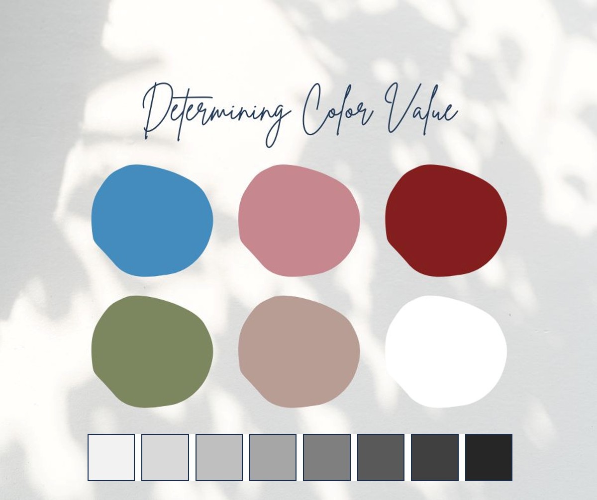
Value, the lightness or darkness of a color, matters more than the hue itself. A quilt with strong value contrast reads clearly even when converted to black and white.
- Light values act like visual sunlight
- Dark values act like visual shadow
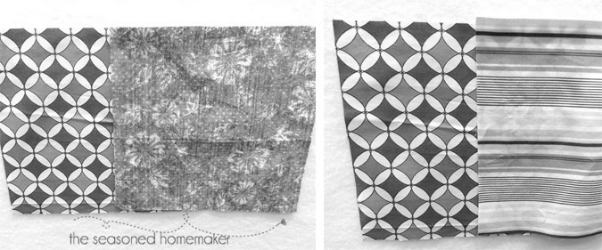
- Mid-tones without contrast create a muddy, undefined appearance
Test your layout by taking a photo and converting it to grayscale. If shapes disappear or blend together, your values are too similar. Mixing multiple lights, mediums, and darks adds sparkle and dimension to any design.
Choose a Color Scheme That Works

A defined color scheme gives your quilt cohesion. These tried-and-true harmonies remove guesswork and ensure your fabrics support each other.
Try a Monochromatic Palette
A monochromatic scheme uses one base hue with variations in tint, tone, and shade.
- Example: Navy, sky blue, powder blue, and gray-blue
- Works well for modern or minimalist quilts
- Add warmth or coolness within the hue for visual interest
This approach creates unity and elegance, making it ideal for beginners learning value contrast.
Build with Complementary Contrast
Complementary colors sit opposite each other on the wheel: Red and Green, Blue and Orange, Yellow and Purple.
- Maximum contrast for bold impact
- Avoid equal amounts; use one as the dominant color and the other as an accent
- Modern twist: Use adjacent shades like Teal and Coral instead of strict primaries
If colors seem to vibrate or buzz, reduce saturation or add a neutral buffer to calm the effect.
Explore Analogous Harmony
Analogous colors sit side by side on the wheel, such as Yellow, Yellow-Green, and Green.
- Smooth transitions create a calming effect
- Ideal for gradations or ombre designs
- Add a neutral like white, gray, or cream to prevent low contrast
This scheme works beautifully for nature-inspired or scrappy quilts with flowing designs.
Use Split Complementary for Nuance
A split complementary scheme uses one base color plus the two neighbors of its complement.
- Example: Blue paired with Yellow-Orange and Red-Orange
- High contrast without the tension of direct opposites
- Lets you incorporate a disliked color indirectly
This expert-level move adds surprise while keeping the palette balanced.
Go Bold with Triadic Harmony
Triadic schemes use three colors evenly spaced on the wheel, such as Red, Blue, and Yellow.
- Vibrant and playful energy
- Requires careful value control to avoid chaos
- Assign one dominant color and use the others as accents
Solids or tonals help ground busy prints in a triadic palette.
Handle Complex Palettes with Care
For quilts with five or six colors, tetrad or square schemes work well.
- Example: Red, Green, Blue, and Orange together
- Creates a glowing, jewel-toned effect
- Vary print scale and include neutrals to avoid visual overload
Treat two of the colors as neutrals, like cream and charcoal, to simplify the overall look.
Plan Your Palette Step by Step
Picking colors is a process, not a guess. Follow these steps to build a cohesive, intentional palette.
Analyze the Pattern First
Before buying fabric, study the quilt design carefully.
- Check the original photo: How many colors appear, and where are lights and darks placed?
- Convert to black and white using your phone’s grayscale filter
- Define the mood: Calm, festive, or rustic? Choose colors that match the feeling
Sketch a value map labeling each section as light, medium, or dark to guide your fabric choices.
Gather Visual Inspiration
Look beyond fabric stores for palette ideas.
- Pinterest: Search for “quilt color palette” or specific scheme terms
- Nature: Photos of sunsets, forests, or ocean scenes offer organic harmony
- Interiors: Home decor palettes are designed for balance
- Fabric lines: Designer collections like Ruby Star Society or Art Gallery are pre-coordinated
Mix fabrics from different lines to create something original rather than predictable.
Create a Digital or Paper Mock-Up
Test your palette before cutting any fabric.
- Digital tools: Use free apps like Quilt Mock-Up or Adobe Express
- Analog method: Cut paper swatches or use coloring sheets of your pattern
- Arrange fabrics: Lay them on a design wall or floor
Convert your mock-up to grayscale to verify the design still reads clearly without color.
Verify with Physical Swatches
Screens lie, so always check fabrics in person.
- Order solid swatch cards from brands like Kona Cotton or Ruby + Bee
- Check lighting: View fabrics in natural daylight and under store lights
- Test texture: Shiny or textured fabrics reflect light differently than matte ones
- Try the pull test: Hold a focus print and gather solids that match its undertones
Skipping this step often leads to costly fabric mismatches later.
Select Fabrics with Strategy
Once you have a palette, choose individual fabrics that enhance the design rather than overpower it.
Start with a Focus Print
Build your palette around one favorite fabric.
- Identify its dominant color and subtle undertones
- Pull solids that match those exact shades
- Match the tone: A muted print needs muted companions, while a bright print needs clear, vivid colors
For example, a vintage floral with dusty rose and sage green pairs well with soft pinks, warm grays, and olive solids.
Mix Print Scales and Types
Avoid visual fatigue by including variety.
| Print Scale | Use Case |
|---|---|
| Large | Focal points and borders |
| Small | Backgrounds and filler areas |
| Tonal | Movement without chaos |
| Solids | Emphasize value and simplify |
A good rule of thumb is to include two smaller-scale or solid fabrics for every large print.
Use Neutrals as Design Tools
Neutrals are essential, not afterthoughts.
- White, cream, gray, black, and beige act as resting spots for the eye
- They make bright colors pop
- Match neutral temperature: Warm palettes pair with cream or tan, while cool palettes pair with cool gray or bright white
Buy extra background fabric since dye lots change over time, and running out mid-project is frustrating.
Simplify Large Color Counts
For quilts with five or six colors, use these strategies.
- Treat two colors as neutrals, such as light cream and dark charcoal
- Double up on value by using two different blues, one light and one dark
- Group colors as two complementary pairs instead of six singles
This reduces clutter while maintaining richness in the overall design.
Use Tools to Make Decisions Easier

Smart tools help you see what your eye might miss, especially when it comes to value.
Test Value with a Ruby Ruler
A Ruby Ruler is a red acrylic tool that removes color and shows only light and dark.
- Hold it 6 to 12 inches from your eyes over the fabric layout
- Dark areas appear black, while lights appear white
- Reveals muddy zones where values are too close
This tool costs around $15 and lasts for years.
Use Your Phone’s Grayscale Filter
Instantly check contrast with your smartphone.
- Take a photo of your layout
- Apply the black-and-white filter without contrast boosters
- Ask: Can I see the design clearly?
Use this test at every stage, from swatch pile to finished design wall.
Try Digital Color Apps
Apps help you explore schemes before shopping.
- Adobe Color: Build palettes from photos or the color wheel
- Spoonflower Palette Generator: Upload an image to extract colors
- Canva Color Wheel: Test harmonies online
These tools work best during the planning phase, before you commit to purchases.
Avoid Common Color Mistakes
Even experienced quilters make these errors. Learn to spot and fix them early.
Fix a Muddy-Looking Quilt
A muddy quilt lacks definition, and shapes blend together because all fabrics are mid-value.
- Add a true light like cream or pale yellow
- Add a true dark like navy or charcoal
- Use the grayscale test to verify contrast
One very dark or very light fabric can completely transform a flat design.
Tame a Shouting Print
A shouting print dominates the quilt and pulls focus away from the rest.
- Replace it with a similar hue but lower intensity
- Use it in smaller pieces or as an accent border
- Surround it with tonals or solids to mute its impact
Swapping a neon pink floral for a dusty rose tonal often solves the problem.
Match Undertones Correctly
Two blues that look like they do not belong together usually have different undertones.
- One blue may have a red undertone (violet-blue), while the other has a green undertone (teal)
- Group warm blues separately from cool blues
- Use a neutral like gray or beige to bridge incompatible tones
Place fabrics side by side under natural light to test whether they clash.
Reduce Visual Overload
A quilt feels chaotic when too many large prints compete without neutrals or value range.
- Replace one large print with a small-scale or solid fabric
- Add a light neutral background
- Ensure you have at least three distinct values
More colors always mean a greater need for balance.
Apply Pro Tips for Confidence

Use these expert strategies to refine your process and avoid frustration.
Test Palettes on Small Projects
If unsure, make a mini version first.
- Create a pillow, wall hanging, or block sampler
- Test how colors behave when sewn together
- Adjust before committing to a full quilt
This approach saves both time and fabric.
Audit Your Fabric Stash by Value
Sort your stash by light, medium, and dark rather than by color.
- You might have 20 blues, but all could be medium value
- Identify gaps: Do you lack dark reds or light yellows?
- Restock with value in mind
This habit makes future projects much easier.
Embrace the Iterative Process
Color selection is not final until you sew.
- Lay out fabrics, step back, and take photos
- Wait a day, then re-evaluate
- Swap one fabric and retest
- Use your design wall to experiment freely
Avoid cutting until the layout feels right.
Document What Works
Keep a quilt color journal to build your personal library.
- Take photos of successful and failed combinations
- Note the scheme used, values, print scales, and neutrals
- Include fabric names or attached swatches
Over time, this journal becomes an invaluable reference.
Get Feedback Early
Share mock-ups with others to catch issues you might miss.
- Local quilting guilds offer in-person feedback
- Online communities on Instagram or Facebook provide quick responses
- Friends with good design sense often spot value problems immediately
Fresh eyes catch what you overlook, especially value issues.
Adapt to Specific Quilting Scenarios
Different projects call for different approaches. Tailor your method to the situation.
Recolor a Pattern Successfully
Want to make a quilt but dislike the original colors? Follow these steps.
- Take a black-and-white photo of the pattern
- Identify the value map: light, medium, and dark areas
- Choose new colors with the same value distribution
- Assign the darkest new fabric where the original dark was
This approach preserves the design impact while telling a fresh color story.
Use a Difficult Color You Dislike
Even disliked colors can find a place in your palette.
- Use split complementary: Make red the base, paired with yellow-green and blue-green
- Use it in small doses as a print accent or border pop
- Mute it by choosing a shaded version like rust or burgundy
You control how much attention the color receives.
Turn Seasonal into Everyday
Love autumn colors but want a year-round quilt? Try these adjustments.
- Add a cooling color like soft blue or sage green
- Replace a dominant warm background with cream or gold
- Mute the palette by using tonals instead of brights
These tweaks keep the warmth without the seasonal theme.
Frequently Asked Questions About Picking Quilt Colors
What is the most important factor when choosing quilt colors?
Value, the lightness or darkness of a color, matters more than hue. A quilt with strong value contrast reads clearly even in black and white, while poor value contrast creates a muddy, undefined appearance regardless of how beautiful the colors are individually.
How many colors should I use in a quilt?
Most quilts look balanced with three to five colors plus one or two neutrals. Beginners often do well starting with a monochromatic or analogous scheme, while experienced quilters can handle tetrad or square schemes with careful value management.
What is the easiest color scheme for beginners?
Monochromatic schemes are the easiest because they use variations of a single hue. This approach teaches value contrast without the complexity of balancing multiple competing colors, making it perfect for learning the fundamentals.
How do I fix a quilt that looks muddy?
Add a true light fabric like cream or pale yellow, and add a true dark like navy or charcoal. Then use the grayscale test on your phone to verify that shapes now read clearly. One very dark or very light fabric can transform a flat design.
Can I use colors I do not like in a quilt?
Yes. Use a split complementary scheme where the disliked color becomes the base, flanked by neighbors of its complement. Alternatively, use the color in small accents or choose a muted, shaded version like burgundy instead of bright red.
Do I need special tools to pick quilt colors?
Helpful tools include a Ruby Ruler for value testing, your phone’s grayscale filter for instant contrast checks, and apps like Adobe Color for exploring harmonies digitally. Physical swatch cards from brands like Kona Cotton also ensure accurate color matching.
Key Takeaways for Choosing Quilt Colors with Confidence
Learning how to pick colors for a quilt transforms your work from random to resonant. Start by prioritizing value over hue, since contrast matters more than specific colors. Choose a scheme that fits your skill level and project goals, then test your palette through mock-ups and physical swatches before cutting fabric.
Your next step is simple: pick one small project and apply the grayscale test to a potential palette today. Seeing your fabrics in black and white reveals value issues immediately and builds the confidence to tackle larger quilts with clarity and intention.